- Table of Contents
- 1. Buttons
- 2. Text Fields
- 3. Other controls
- 4. Panels
Chapter 1. Buttons
All the following items are derivates of NSButton, the GNUstep button class.
Standard buttons>
 Buttons are objects that you can click to confirm a dialog, with ofcourse a possibly different text on them.
 Buttons can be used to set certain actions. A button that is active is white, while non-active buttons are grey.
 When a certain default action is assumed, the button has a dotted frame on it. This means that just pressing <Enter> will activate this botton.
Buttons can have various states.
Buttons can be used as confirm buttons, which means that if you click them a certain action is performed.
A button can be used as a toggle button, which means that clicking them sets a certain state. More like a on/off switch.
CheckBox
CheckBoxes give the user the ability to choose one or more options from a list.
 The option is not selected.
 The option is selected.
Radio Buttons
Radio buttons are used to give a user a single selection option. The user can choose one option from a list.
 The inactive radio button is transparent in the middle, thus showing the background that it is on.
 The active radio button has a white middle.
The above explains why you should never use white backgrounds for radio buttons
Pop-up List
 Pop-up lists are indicated in a window by the fact that they have a nibble
 on the right. When you click the bar and hold your mouse button a list of choices pops up.
By moving your mouse up and down you can select an entry. Releasing the mouse button with an item in white, selects this item.
Resize Knob

The Dimple can have different meanings. As described below in the scroll bar section it has a different meaning then in this section. This section will the describe the Dimple in its Resize Knob function.
When the Dimple is found in a window, but not within a button or something, it has the special meaning of Resize Knob.
When you click the Resize Knob and hold your mouse button you can increase or decrease the size of the element within the window where the Resize Knob is located. A white bar indicates what the new size will be. Releasing the mouse button will activate the change.
Chapter 2. Text Fields
TODO: Creating text, arrow keys, delete key, enter key, selecting, copy, delete, cut, paste
Normal text field

Secure text field

Table header cel
Editing text
 The first action you will usually perform is to enter some text into a text editing area. This can be a word processor, or a simple text field where you have to fill out e.g. your name.
To start inputting data, click on the white field. If you see the cursor appear, like this |, you can start to add text.
Selecting text
Move you mouse to the place where you want to start. Press your mouse button and drag the mouse to where you want to end. Release the mouse button. The grey field that appeared is the selected text.
Some Edit menus have the Select All option. Clicking this option will select everything that is in the current text field. The first command key and a are the keyboard equivalent.
Deleting text
Deleting text can be done in several ways.
Deleting characters
To delete text that is to the left of the cursor use the backspace key.
To delete text that is on the right of the cursor use the delete key. Another option is to use the Delete entry from the Edit menu.
Deleting selected parts
After you have selected the text press the delete or the backspace key. You can also select the Delete option from the Edit menu. All have the same effect.
Copying text
Copying is done through the first command key and c or the copy entry in the Edit menu.
First select the part you want to copy, press first-command-key+c. The data is now copied to the pasteboard.
Paste text
Pasting of data from the clipboard is done through the first command key and v or the Paste entry from the Edit menu.
Move the cursor the position where you want the part to be placed, and click the mouse to place the cursor. Now press first-command-key+v to paste the data.
Cutting text
The cutting of text is like replacing text. The first command key x or the Cut option from the Edit menu are used for this. The data you have selected and cut, will be removed from the text field and copied onto the pasteboard.
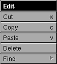
Finding text
Select from the Edit menu the Find menu. On the Find menu you have the Find Panel option. If you select this you get a panel like this:
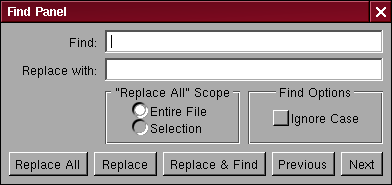
Type in the Find: text field the string you want to find and click Next to find something that is located to the right or below the cursor, or click Previous if you want to find the string to the left or above the cursor.
If you are not sure about the case you can set the Ignore Case box before searching. Then all matches, ignorant of case will be found.
Replacing text
Go to the Find panel as described in the previous section.
Fill in the text you want to find and the text with which you want to replace it. Now you have different options.
You can click the Replace All button to replace all found matches. With this option you can choose between doing this in the entire document, or just in a by you selected piece.
Another option is the use Replace & Find, which will replace the first match and find the next one, which is then highlighted.
Clicking Next will search the next match without replacing.
Clicking Replace & Find again will replace the text and will highlight the next match.
Or you can click replace. Which will replace the highlighted match and the stop (it keeps the replaced match highlighteed).
Chapter 3. Other controls
TODO: Sliders, Steppers, Matrix, TableView, OutlineTableView
Scroll bar
 The scroll bar consists of several components. There is the scroller knob and the buttons with the triangles on it.
The knob
The knob is sized to the size of the document. The larger the document, the smaller the knob, but it will never be less than the size of the Dimple. Which leaves you enough room to get a hold on it.
The Dimple is used to indicate the cursor position within the document you are working on.
Buttons
The bottons on the bottom of the scrollbar, or on the left if it is about a horizontal scroll bar can be used to scroll by clicking. It is a finer way of scrolling through a piece of e.g. text. Using the knob to scroll roughly to where you want to be, you can use the buttons to exactly position yourself within the text.

Browsers
Chapter 4. Panels
TODO: HelpManagerPanel, DataLinkPanel, HelpPanel, MenuPanel
Info

An info panel gives you information, in this case about the name of the application, it's creator and the license it is released under. Info panels don't have buttons or knobs or any other UI elements. The only thing you can with them is read them and close them.
Alert panel
File control
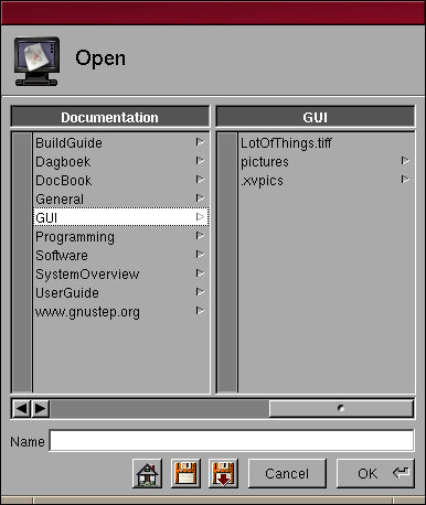
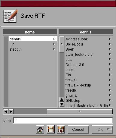
The File Open and File Save panels are, as you can see identical. They only defer in their function.
Colors
The color well
 Through the color well you get to set the color for a certain object. The well indicates the currently set color. By dragging the color of one color well to another you can change the colors, this make both color wells identical. By clicking the thick frame you get access to the color panel.
The color panel

The black and white button and the colored circle button can be used to toggle one of both. The actual choice is between using sliders to control the colors (shades) or to use a colorcircle.
The next line of toggle buttons, gives you the options to change from left to right:
black and white settings
the Red/Green/Blue settings
the Cyan/Mangenta/Yellow/Black settings
Hue/Saturation/Brightness settings
Font panel
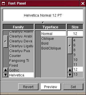
When you select a font menu item, you will most likely be presented with the above Font panel. In applications supporting the change of fonts the font panel can also be accessed by using First-command-t.
From top to bottom the Font panel contains a preview window, a font choice browser with next to it a size browser, and a couple of control buttons.
 | If the font preview window is empty, click the preview button. |
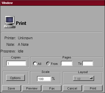
Print panel
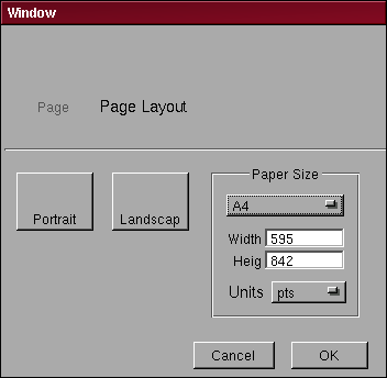
Some print panels might have the Page Layout panel.